haus of pain
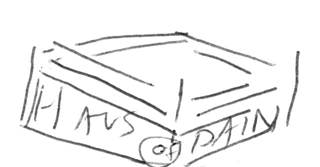
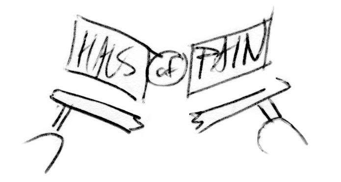
Process: The client was in need of a logo for their soon to be released documentary on underground wrestling. The topic was of personal interest to them, and every intricacy of their knowledge on the topic was distilled into the end result, evocative of the energy of homemade wood block flyers, while paying homage to the arena posters of the 60’s.


